Friday, 21 December 2012

Alternative Processes: Acrylic Gel

Assignment #12:


This was actually my second attempt at an acrylic gel print, but I lost my first one.  I was afraid that this one wouldn't work out because of the colour ink and the type of printer, but thankfully it did.   This picture is important to me because it was one of the first pictures I ever took with my old camera (which was new at the time).  I was at a farm and this dog just ran up to me and was so happy and excited, so I looked down and took a picture of her.  The shininess in the eyes reflect just the pure happiness that dogs feel when meeting a new person.  I love being able to mold and shape the acrylic gel is fun and functional, making the photo really come to life.  

Alternative Processes: Silk Screen

Assignment #11:


Silk screen was a really fun, yet really stressful process to do.  From the painful staple gun, to the messy emulsion, to the light table and finally to the scrubbing of the screen; the whole process is a long and trepedatious one.  At first I had many ideas for what I wanted to make my t-shirts look like, and deciding on one was a hard decision.  I knew I wanted to do something about music as soon as I heard what this process was all about.  I decided to use two pictures of my main instruments I play, a symbol of music notes to put on the back of the t-shirt, and a quote that I love.  I wanted to be able to make as many combinations of t-shirts that I could, so I had many parts and endless possibilities onto what I could make.  I love t-shirts that represent the wearer, so I wanted to create something that truly represented me.  The symbol on the back of the t-shirt really adds to the uniqueness of these shirts, and I am very happy that I thought of the idea and that it worked out.  I made 3 t-shirts with different designs, but with a sincerity and deep feeling on each.  


This t-shirt has to be my favourite because of the simplicity and beauty that makes me drawn towards it.  I've worn it once, and have gotten many compliments, questions and surprise when I told them that I made it.


I like this shirt because of the humour it gives and how much it represents myself.  This is a true representation of the "story of my life".  


This is my least favourite t-shirt only because it shifted slightly while I was applying the ink, so it is not as nice as I would have hoped, but the idea is there all the same.  I used my whole silk screen for this one (except for the "Weapon of Choice" saying) so it is kind of an important t-shirt.  

Thursday, 20 December 2012

Alternative Processes: Multiple Exposure

Assignment #10:


This photo was off something I saw online for examples of multiple exposures with negatives.  It involved sandwiching 2 negatives together and exposing the photo paper through those two.  Though it was hard to predict what the photo was going to look like when exposed, I was interested to see how it would turn out.  

This photo has deep meaning in that it expresses the inside emotions of a tortured soul.  Though the person remains stoic and without emotion in one part of the photo you have a glimpse into the deep melancholy that this person is feeling.  Maybe the world is getting too much for this person and her inner feelings are starting to seep out of her, beginning to crack the thick outer façade of emotions.    

Monday, 3 December 2012

Breaking the Rules

Assignment #9:


The first time I saw this photo, I fell in love with it and I didn't know why.  I started showing it to all my friends, trying to find an explanation to why I was attracted to it.  My friends were saying, "It looks like the subject is looking in the mirror, but they're really not."  The pure emotion that this photo secretes makes this photo so attractive and compelling.  This photo tells the story of a family with a dog and kids, eating a simple dinner at home.  This photo breaks the rules because it is not centered, and shows the story of a family through slightly distorted eyes.  It is not balanced correctly, as the dog on the left contrasts the the empty space on the right, but not quite asymmetrically.  There is no emphasis on any one thing, as the subject could either be the back of my mom, or the face of my dad.  The subject is half-framed, but not quite enough to draw your eye one way or another.  There is no prominent lines that draw the viewer's eye anywhere around the photo, so it creates a sense of unease and uncertainness.  I love it.


This photo is another great one.  Though it doesn't have as great a story as the last photo, it is still a good composition.  It tells the story of a dark forest and a pathway that leads to the creepy, dark section of the forest.  It breaks the rule of line, as line is supposed to lead to a certain part of the photo, where the line in this photo leads just to the right of the large, creepy tree that is supposed to be the subject.  The balance is also off because the white sign post is not balanced by anything on the right.  There is no 'real' framing, so there is no real focus point for the viewer's eye.


This photo breaks the rules because half if it is in focus, and half of it isn't.  Usually that isn't a problem, but in this photo, the blurred part of the photo is in the foreground and the background, with only the middle ground in focus.  The foreground is slightly overlapping the middle ground, creating a sense of depth and framing.  This photo tells the story of a basic green house that has dead flowers because it is the winter.  The in focus part of the photo is halfway framed by blurred part, but not enough to have a clear focal point.  There is definitely no definite symmetry, and no clear lines leading to anything specific, creating a photo that is slightly uncomfortable and without point.  

Saturday, 17 November 2012

Multiple Types of Light

Assignment #8: 


I seem to be finding myself coming back to taking pictures of relating to music, which I suppose is my inspiration.  Sorry, I couldn't pick just one.  For both these photos the aperture was 7.1, the shutter speed was 1/200, and the ISO was 400.  The two types of light were natural sunlight (it was a cloudy day) and the flash firing from my camera.  I had to adjust my settings a lot to get the effect I wanted.  I love these photos because of the mix between the outside and the coolness of a trumpet.  Instruments are usually not portrayed in this type of setting, and the cool lighting, combined with the unique scenery make these photo special.  These photos mean so much to me because of the obvious reasons (the trumpet), but also because of the deeper meaning.  A connection between nature and music represents how true and simple music is, but also how complicated and beautiful it can be.  Just simple shots of parts of the trumpet may not make it obvious to the viewer of exactly what is the subject of the photo from first glance, but all they know is that it is beautiful.  This is relatable to music as most people see the outer shell and beauty of music, but don't understand how deep and complicated it can be.

The Renaissance

Assignment #7:


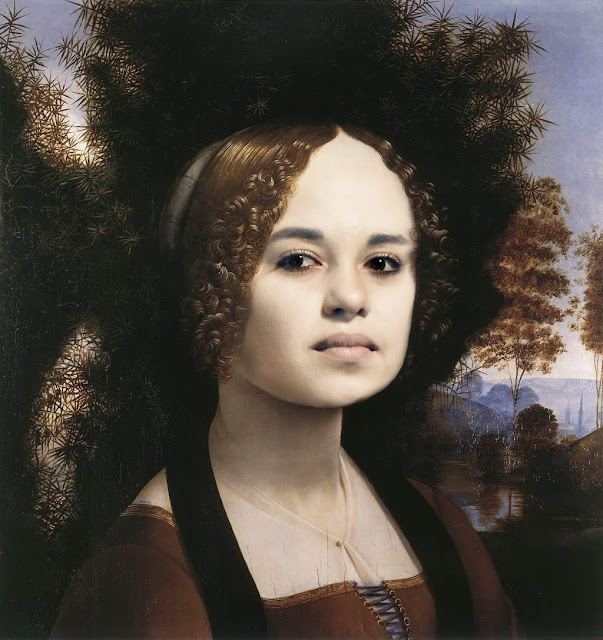
The Renaissance began in Italy in the 14th Century.  By the 16th Century it spread to the North, including England, and ended in the mid-17th Century.  The Renaissance affected literature, philosophy, music, politics, science, religion, art, and other aspects in culture.  Renaissance artists searched for realism and human emotion in their art through the development of perspective, light, shadow, and human anatomy.   The artists desired to depict the beauty of nature by developing a manner of painting that was unpredictably naturalistic, 3-D, life-like, and classicising.   Artists incorporated a greater sense of light and colour through new mediums.  Some techniques that they used were:  Humanism and Perspective - Where the idea of perspective it to create a three-dimensional appearance on a two-dimensional object.   Sfumato - The idea was to blend one shade into another to create the appearance of depth, form and volume.  Chiaroscuro - Using the contrast of light and dark to create dimension.  There are many more techniques, and these techniques are still known and used in modern day.  Giiotto was one of the first to paint in this new style.  Giotto's paintings began to show real emotion, perspective and solidity.  Leonardo da Vinci and Michelangelo are also famous artist of this time, with their work still famous around the world.  The ideas and techniques of these artists were copied and improved upon by other artist ad inventors.  This really improved and expanded the sense of artistry and the overall affect of art in the world at that time. It turned art into more than just a craft.  It turned art into what it is today. A lifestyle.  It changed the spectator's view of art from just a show of skills to a telling of a story. 

                The original painting Ginevra de'Benei by Leonardo Da Vinci.  Givevra de'Benei was an aristocrat from 15th-century Florence, and the portrait was painted to commemorate her marriage.   "This portrait of Ginevra shows the female with a marble-like skin and hair styled in ringlets framing a face portraying a sulky and proud facial expression."   She was 17 and her fiancé was twice her age.   It is a significant painting for Leonardo Da Vinci because his paintings were so rare.   The alabaster smoothness of her face was an effect that Leonardo accomplished by smoothing the surface of the paint with his own hands.  Leonardo was the first painter to have the perfect control over his medium to achieve the look of light and shade to merge them imperceptibly.   A juniper bush can be seen in the background of the portrait, which makes sense as 'Ginevra' in Italian means juniper.  On the back of the painting is a 'heraldic motif' that includes a sprig of juniper encircled by a wreath of laurel and palm.  This painting is the first psychological portrait ever painted and one of the first three-quarter or frontal view of the sitter.  Leonardo's innovation was developed during his painting of 4 women, where each woman expresses different moods.   In this painting, Leonardo shows us the 'enigmatic melancholy' of Ginevra de 'Benei.  Sadness had rarely been represented in portraiture before the 17th century, and even then, the tragic view of life was usually conveyed through portraits of men, not women.   

                Leonardo da Vinci was (and still is) one of the most famous Renaissance painters.  He was born in 1452 in the village of Vinci, and began his career working for a master painter in Florence.  As Leonardo's fame grew, he was recognized as truly a "Renaissance Man", being skilled in many fields; he as a scientist, an inventor, as well as an artist.  He had major influences in the design of hydraulics, mechanical engineering, structural engineering, and advanced weaponry all used during this time period.  He also influenced science and mathematics in his use of geometry and his diagrams of the human anatomy (which were illegal at the time), bringing knowledge in medical science which were used then, as well into modern times.  As an artist, he rejected using the medium of tempera paints, and chose oil instead.  Contrary to the beliefs previous artists, Leonardo discovered that objects were not comprised of outlines, but were 3-D, defined by light and shadow.  He also used perspective, and saw that an object's detail and colour changed as it receded into the distance.  As a perfectionist, he sought out the 'ideal; human figure through studies of the physical proportions of men, women, and children.  Today, Leonardo's paintings are displayed and admired all over the world, inspiring aspiring artists to break the rules a little, and open their minds to infinite possibilities.   

Original Painting:


Monday, 12 November 2012

Journalism - The Royal Winter Fair

Assignment #6:


This is Mandy.  Mandy's favourite animals are horses.  Though I did not see her around the horse stables, I caught her being perfectly content to pet a goat at the petting zoo.  I met Mandy, her helper, and a large group of her friends by the petting zoo.  Mandy was very talkative about how she wanted to go and see the horses, and go horse-back riding.  Though I didn't see them for the rest of the day, I hope she got to see the horses and go horse-back riding.  
They are from Harmony Place Support Services which is a building that houses adults with developmental disabilities.  They have day programs that include topics such as social, educational, recreational, health and wellness, and vocation.  This non-profit organization does their best to keep the people in the programs healthy and happy.  

Shot with an aperture of 4.5 and a shutter speed of 1/100, I love this photo and even enjoyed talking to the people for the information.  I like this photo because it shows a totally different side of the Royal Winter Fair.  Usually it is all about families, animals, and buying things, but this photo shows what joy it can bring to people.  Going to the fair probably meant so much to these people, so to capture even a small part of their joy means a lot to me as a photographer.  

Friday, 2 November 2012

Painting With Light

Assignment #5:


I had so much fun and so much inspiration when taking these pictures.  I had this idea from the very beginning, but to actually go through with it, and to have results like this makes me very happy.  For this photo I set my camera to aperture 25 and shutter speed to 10 seconds.  I used a flash light that I just had lying around the house, and, well, painted with light.  I used a very cheap flash light that happened to have an outer plastic coating that was red around the handle and circling the light.  That's why there is the red 'aura' around the while light. 

"Music cleanses the understanding; inspires it, and lifts it into a realm which it would not reach if it were left to itself." ~ Henry Ward Beecher


This photo has meaning because I am inspired by music.  The beautiful reflection on the piano and the piano keys makes this photo beautiful and not cheesy.  To me, the streaks of light represent the spark of insanity that needs to be present when you make music.  Lines going in chaotic, yet organized lines represent the structured madness that is music.  The lines leading off the picture state that you cannot think inside the box when making music and your thoughts need to be free-flowing and positive.   

"A painter paints pictures on canvas.  But musicians paint their pictures on silence."  ~ Leopold Stokowiski


Sunday, 28 October 2012

Perfect Studio Lighting

Assignment #4:


I was surprised about how much I liked the studio lighting unit.  It was so much fun to capture my friend's expressions and it was VERY VERY difficult to choose just one for my project.  I started with doing my project in-class, but I really wanted to put my friends in front of the camera.  The lighting was simple, with the 1:2 ratio rule, one big light (like the soft box light or the light with the umbrella) and a smaller, closer, fill light.  I chose black and white for all my photos.  I chose black and white because it is simple and displays expression 100x better than colour.  I tried a few photos in colour, but none of the had nearly the emotional impact than black and white.Since I love photography that displays expression, I decided to follow the style of Richard Avedon.  I sat my model down, set the lighting, positioned the camera, and stepped away from the camera, keeping my finger on the shutter button.  Then I would talk to them.  Ask them question, tell them stories, making them laugh, smile, and just act natural.  I also took some of my other friends along to stand behind the camera and talk to the model, making my job a lot easier.  


I love this photo because of it's simplicity.  No crazy light reflections, no terrible shadows, just pure personality.  The aperture of this photo was 5.6, and the shutter speed was 1/80.  I positioned the soft box light slightly behind the camera on the left.  The other light was a florescent fill light off to the right, and pretty close to my subject.  The light shadows in the wrinkles between her eyes and on her laugh lines contrast the bright, almost overexposed nature of the rest of her face.  Though I have so many pictures of my friends laughing, smiling, and even being serious (yes, it's possible), I decided that this one shows personality, rather than emotion.  That's what makes if different.   


I love this photo because of the joy it shows.  The cut off look of the subject makes it look that the subject is so happy and comfortable that she is moving around and laughing like crazy.  The aperture of this photo was 5.6 and the shutter speed was 1/125.  I positioned one light with the umbrella on it on the right of the camera, and a florescent fill light closer to the subject on the left.  She has such a big smile on her face, and her body language indicated comfortability, which is exactly what I wanted to capture.  This picture speaks happiness, simplicity, and a light feeling of personality.  Just the unique composition makes me love this photo so much.  


I love this photo because of personality it shows.  Thought it is not a smiling, happy picture, her eyes tell a story.  The aperture of this photo is 5.6 and the shutter speed 1/200.  I positioned one light with the umbrella on the left of the camera to create a nice glow on her face, and a sharper, less diffused light on the right to fill in the shadows.  Her insightful eyes suggest that she is a good listener (which she is), and that she cares deeply about those she loves.  I think this is when I was talking to her about a deeper topic, and she would listen, and smile, and nod, and just be a wonderful friend.  Just looking at this photo for a while gives the viewer a deeper insight into her personality, and I like how simply this photo gives it off.  Just the mesmerizing factor of this photo makes me love it so much.

Thursday, 11 October 2012

Multiple Exposure

Assignment #3: 


I was excited for this project as soon as I heard about it because I have never really done anything like this before.  I took my two subjects and told them to do leapfrog, then stop, then leapfrog again.  I used my continuous shutter for this, and my camera was on Manual.  I thought it would look neat because it shows the same girl on the ground and the same girl jumping over to create an optical illusion.  I enjoyed using photoshop for this project and I am glad about the skills with it that I have gained throughout this project.

Monday, 8 October 2012

Tuesday, 25 September 2012

My Favourite Photographer - Robert Doisneau

Assignment #1:


Born in Gentilly, France, Robert Doisneau first studied engraving at the Ecole Estienne, but found the training useless upon graduation.  Then he began photographing details in a pharmaceutical firm, and that's where his love for photography took off.  Upon being fired from an industrial and advertising photography job at an auto factory in 1939 he took up freelance and postcard photography to earn a living.  He got his inspiration from Kertesz, Atget, and Cartier-Bresson.  See his site.


Musician in the Rain:


Accordionist:


Hell:


I like his work because he captures the everyday in such a meaningful way.  Just a simple man walking down the street looks like he is being swallowed by a monster (see above photo).  They represent the simplest things in life shown in a complex and emotional way.  I like his style of 'simple but out of the ordinary' and his eye opening way of capturing the everyday.  It seems like most of his photos taken while he is just walking down the streets, and taking pictures to preserve moments in time that will never be there again.  A specific expression on a person's face, the way they move their arms, the split second before they leap off the curb; is how photography should be done.  He even has a picture of 2 statues, STATUES, that has a deep emotion, but such a simple look.  These are the kind of pictures I want to take. 

 "The marvels of daily life are exciting; no movie director can arrange the unexpected that you find in the street."  - Robert Doisneau